
8 common Design Mistakes and How to Fix Them
By Blythe Interiors | A San Diego–based interior design studio specializing in full-service remodels.

Today, we're diving into some of the most common design mistakes that can trip up even the most enthusiastic interior design lovers. Before you scroll through and panic that you’ve made some of these faux-pas, don’t fret! These are easy mistakes to make but also easy to remedy, especially with these simple tips and beautifully styled rooms for reference, your home will be looking designer-curated in no time!
Happy reading!
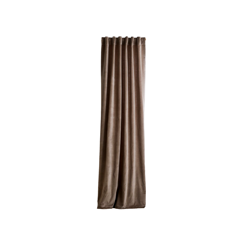
1. Hanging curtains too low

This is an incredibly common mistake and maybe one of the most impactful once it’s remedied. “But what’s the deal with this mistake?” You might be wondering. “Why wouldn’t I just hang my curtain rod right above the window?”

Well, look at the graphic above. Those windows are the same size but look how much bigger the one looks on the right! Mounting your curtains too low on the wall can make the ceiling feel shorter, and the overall room feels tighter and smaller. By mounting your curtain rod higher up on the wall, it will draw the eye upward, making your room feel taller and even larger! It’s also important not to mount your rod too narrow on the wall. When you open your curtains, you want them to stack outside of the window so that you don’t block any of that beautiful natural light! There are some pretty amazing “trick-of-the-eye” design hacks that almost feel magical because they have the power to completely transform your space, and this is one of those magical tricks!
Here’s some tips to hang your curtains like a pro:
Typically, you’ll want to mount the curtain rod 4”–6” inches above the window frame.
If you have high ceilings (9’ plus) you can even mount the rod at the ceiling.
The curtain rod itself should be 8” - 12” inches longer than the width of the window.
When purchasing curtains, first measure where the rod is going to be mounted, then measure from there to the floor. We always recommend adding 2” to that length to ensure your curtains aren’t too short.
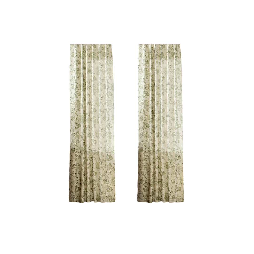
DESIGNER-LOOK CURTAINS & ACCESSORIES


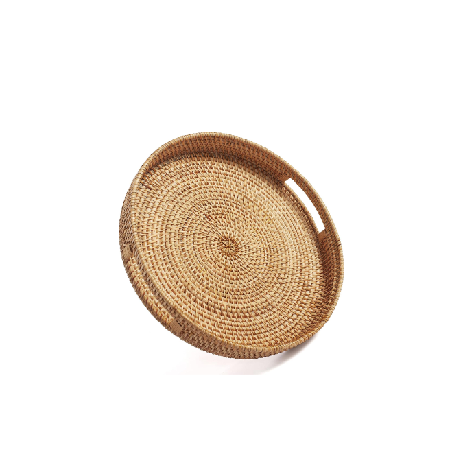
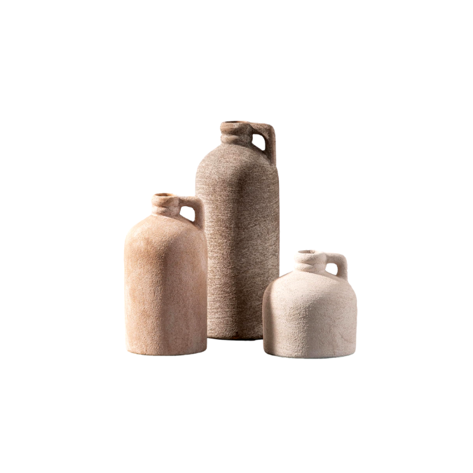
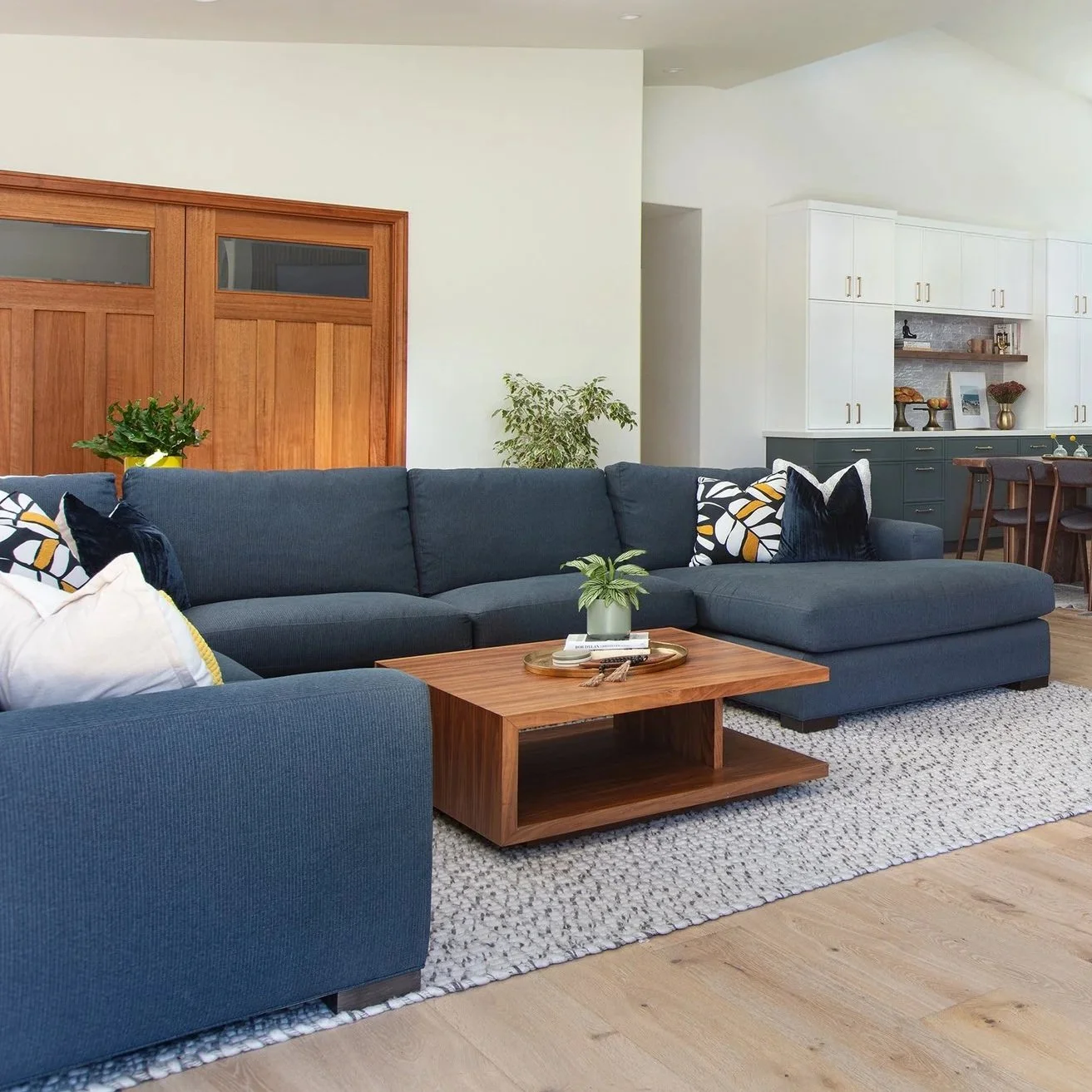
2. A Cluttered Coffee Table

Some of the biggest mistakes people make when styling a coffee table include a lack of balance, cohesion, appropriate scale and just overall too much “stuff”. Follow these tips to ensure a beautifully styled coffee table every time!
Trays for days - A gorgeous tray will ground your display and prevent your styling accessories from appearing scattered or disjointed.
Varying heights - By including objects of different heights, you create a sense of balance and depth. We love a tall vase for adding height!
Greenery - Try a potted plant, stems or florals! Whatever your choice, greenery adds a fresh feeling and instant mood boost that will work with any design style.
Books - Never met a coffee table book we didn’t like. They are great for adding height, color and a sophisticated vibe.
Something sculptural - Something like a decorative chain will bring an artistic feel and elevated vibe. You can also consider a fun memento from one of your travels or a personal keepsake.
Stylish storage - It might be helpful to keep things like remotes or earbuds on your coffee table, but when not in use, consider tucking them away in a decorative box to ensure they don’t cramp your style.
COFFEE TABLE DECOR YOU’LL LOVE


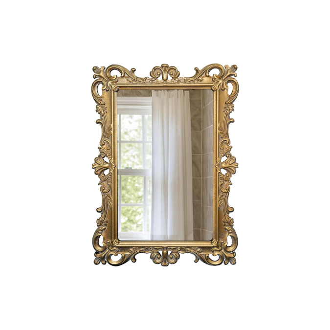
3. Art in the wrong scale
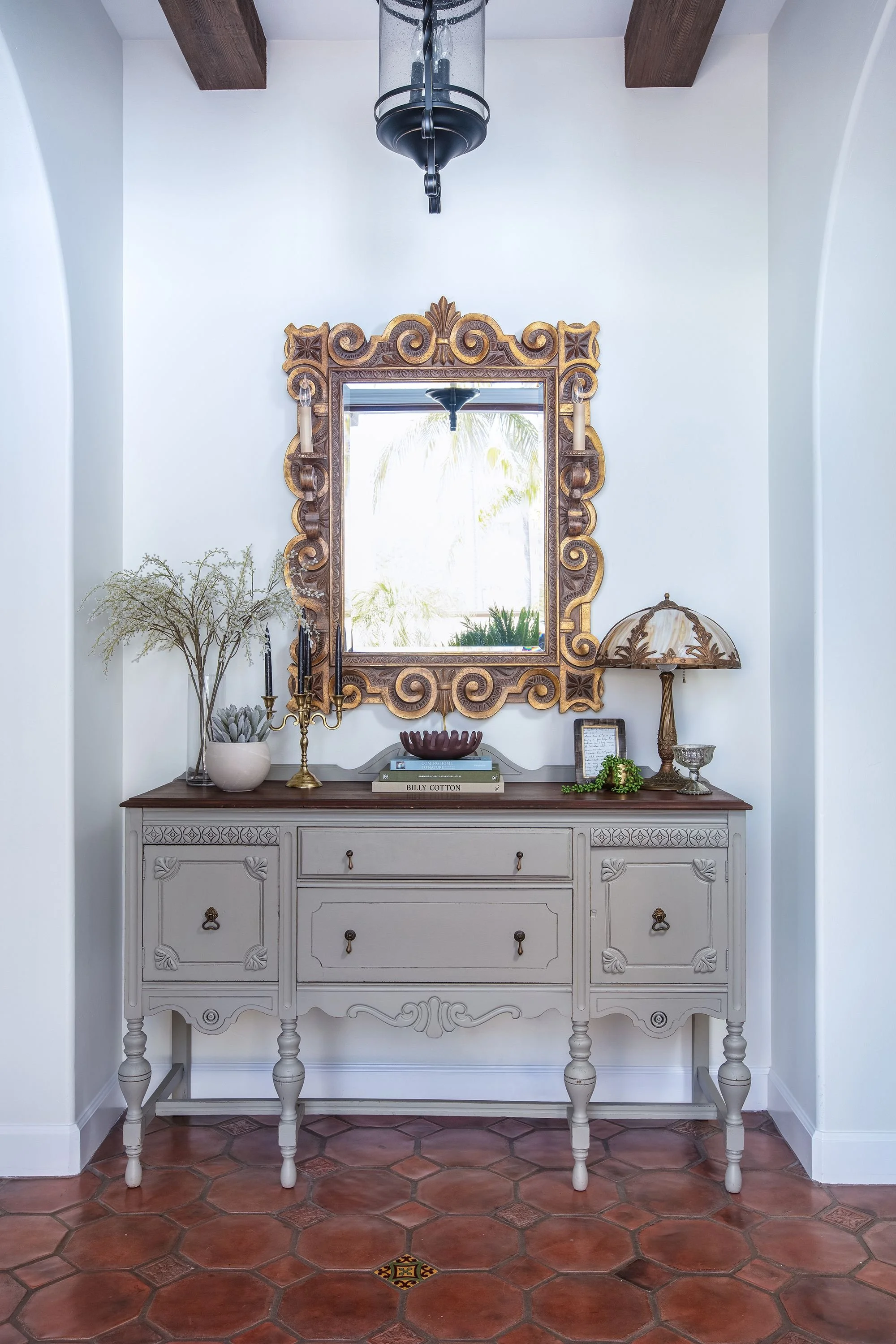
Scale is one of the harder design nuances to get right but once you do, you’ll be amazed by how powerful it is! No matter what you’re mounting on your wall, a single piece of artwork, a gallery wall, a mirror, a wall haning etc. the size should be proportionate to the wall it's mounted on. It just looks unbalanced when there’s a large wall and only one little piece of art, or a small wall with a massive piece of art that’s wayyyyy too big. So, for large walls, consider one, large-scale piece or a grouping of smaller pieces. For smaller walls, try a single smaller piece or two stacked vertically.
WALL DECOR FAVES


Tips to nail the scale!
Furniture Proportion - When hanging artwork above furniture, ensure the piece is about two-thirds to three-quarters the width of the furniture.
Eye Level Placement - The center of your artwork should generally be at eye level, which is approximately 57-60 inches from the floor.
Grouping and Gallery Walls - For a gallery wall or a grouping of multiple pieces, treat the entire collection as a single artwork. The overall width and height of the grouping should follow the same proportion rules as individual pieces relative to the wall and furniture.
Spacing Between Pieces - If you're hanging multiple pieces together, maintain consistent spacing between them. Typically, 2-3 inches of space between frames works well, but this can be adjusted based on the size of the pieces and the desired effect.
4. The Wrong Size Rug
Nothing ties together and grounds a space quite like a rug. Not only do they provide comfort and warmth, but they can act as artwork for your floor - bringing color, pattern, and life into your space. When designing a room, placement is incredibly important and where and how a rug is placed can make or break your room!

Sizing & placement tips:
The average size rug for a Queen bed is 8’x10’ while the average size for a King Bed is 9’x12’
For your living room, ensure that the rug is at least 8” wider than the sofa on both sides
Typically, you’ll run the rug the length of the sofa
The rug size will depend on the dimensions of the room, but most living rooms will need at least an 8’ x 10’ rug
DESIGNER-APPROVED RUGS


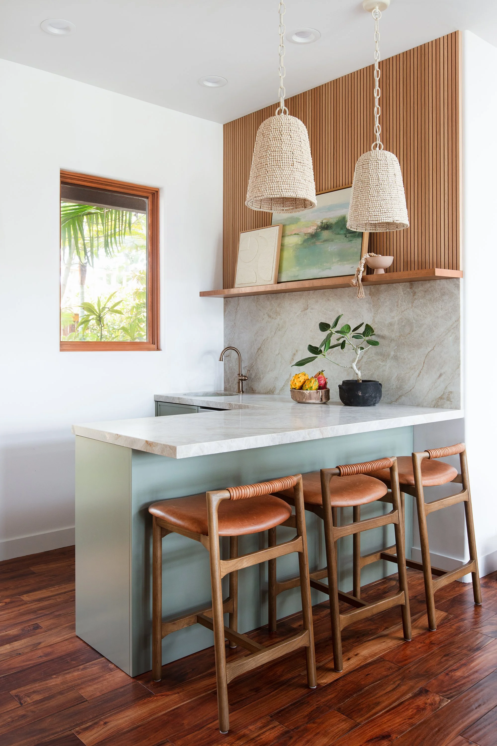
5. Skipping on mood lighting

We’re shouting this one from the rooftops, “ditch that overhead lighting!” Sure, you still need overhead lighting for daily tasks, and they definitely bring style, but by incorporating thoughtfully placed mood lighting, like lamps and sconces, you’ll create a warm and inviting ambiance that overhead lighting simply can't match. Mood lighting brings a soft, diffused glow that makes any space feel cozy and collected.
FABULOUS MOOD LIGHTING
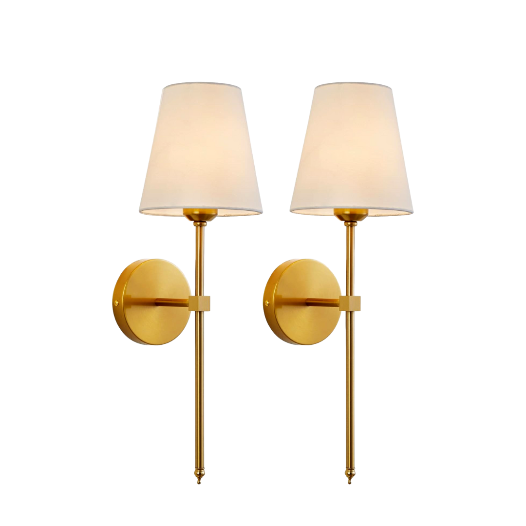

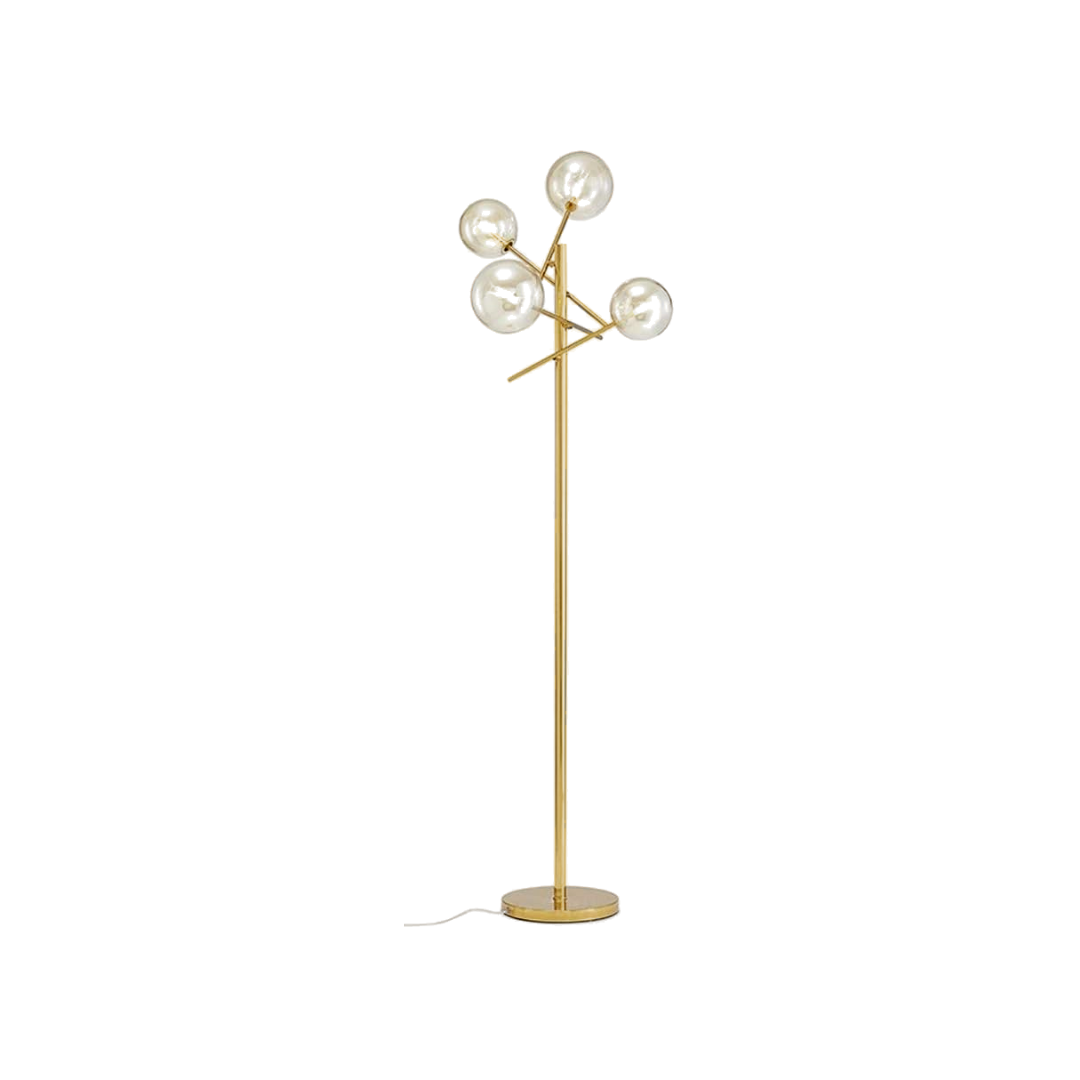

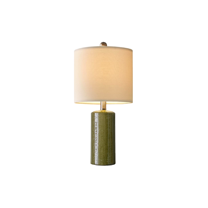


It’s also perfect for setting the right atmosphere, whether it’s a casual family dinner night, a fabulous dinner party or anything in between. When it comes to design and function, mood lighting allows you to highlight specific areas and create layers of light that add depth and character to a room which in turn will give your space a curated vibe.
6. Using the wrong paint sheen
Have you ever gone to buy paint (after endlessly deliberating over your choice) feeling confident about your selection, only to be met with yet another decision to make when you get to the order counter, “what sheen do you want?” Now you’re holding up the line trying to ask the paint specialist about your options or frantically Googling what the best option is… If so, you’re not alone! While it might seem like paint is just paint, using the right sheen is crucial for marrying style and function in your home. Each sheen offers different levels of durability, washability, and visual appeal, making it essential to choose the appropriate one for each space!
Save this little cheat sheet for your next painting project!
Flat/Matte
Best For: Ceilings, adult bedrooms, living rooms, and low-traffic areas.
Why: Flat or matte finishes provide a smooth, non-reflective surface that hides imperfections well. They create a soft, sophisticated look, ideal for spaces where durability is less of a concern.
Eggshell
Best For: Living rooms, dining rooms, bedrooms, and hallways.
Why: Eggshell has a slight sheen, offering more durability and washability than flat finishes while maintaining a low-luster look. It's a good balance between aesthetics and practicality.
Satin
Best For: Kitchens, bathrooms, laundry rooms, and high-traffic areas.
Why: Satin finishes are more durable and easier to clean than eggshell, making them ideal for areas that require frequent cleaning. They provide a soft sheen that adds warmth and depth to the walls.
Semi-Gloss
Best For: Trim, doors, cabinets, bathrooms, and kitchens.
Why: Semi-gloss is highly durable and moisture-resistant, making it perfect for areas prone to dirt and moisture. Its shiny finish highlights architectural details and adds a polished look to trim and woodwork.
Gloss
Best For: Trim, doors, cabinets, and furniture.
Why: Gloss finishes are very reflective and durable, providing a high-shine look that’s easy to clean. This sheen is excellent for highlighting details and creating a striking contrast with matte or eggshell walls.
High-Gloss
Best For: Decorative pieces, trim, doors, and accent areas.
Why: High-gloss finishes offer the most shine and durability, creating a dramatic, modern look. They are ideal for surfaces that need to stand out and can withstand frequent cleaning and touching.
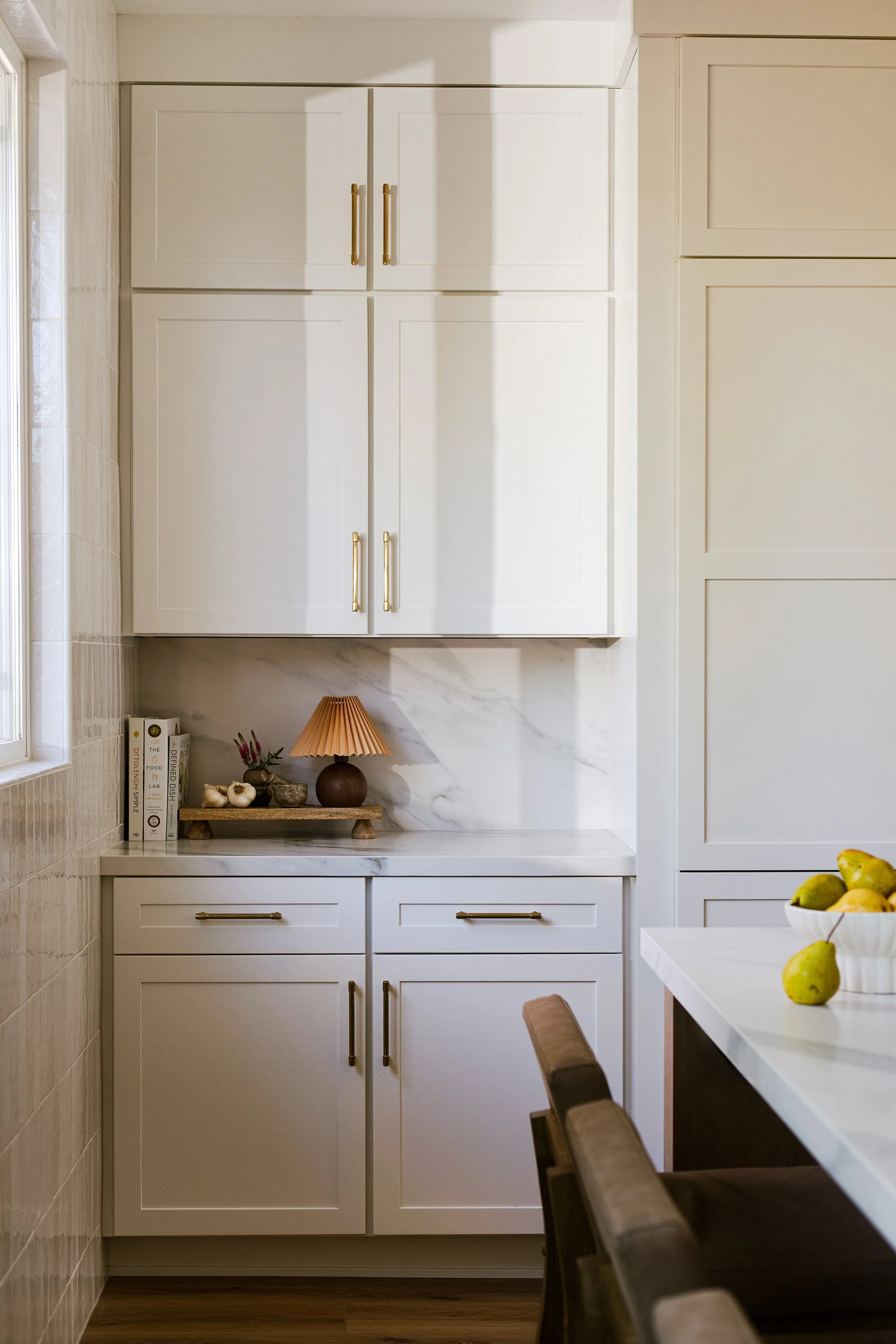
7. FORGETTING THE FINISHING TOUCHES

Whoohoo! You’ve just completed a major remodel or furnishing refresh and your space is complete - or is it? The soft furnishings, or as we like to call them, the “finishing touches” are essential to transforming a house (or a room) into a home. Art, decor, pillows, accessories and plants should be thoughtfully layered into your space. In turn, it will burst with dimension, character, personality and visual interest, all important elements to a well-designed space and one you’ll love to live in.
Mixing old and new is one of our favorite ways to make a space feel curated, so while you’re doing a little retail therapy, it’s also a great time to shop your own home. Dig into those storage closets and see if there’s something forgotten, like a family heirloom, that’s ready to step into the limelight.
FAVORITE FINISHING TOUCHES


8. Focusing only on aesthetics
While design is about making spaces look beautiful, it’s far more than that. It’s about making a space that’s uniquely yours and works for you and your lifestyle. Instead of jumping on a trend, take time to think about how you live in your space, your day-to-day routines and lifestyle needs. If you looooove the look of a light, all-white living room but have 3 kids and 2 dogs, then that aesthetic realistically just might not work. Rather, you might pick and choose certain elements you love from that look and see how you can incorporate that to fit how you live, marrying both style and functionality. For example, if your heart is set on that white couch, consider a high-performance, stain resistance fabric!
Before our first meeting with clients, we advise that they take some time to gather lots of inspiration photos (go wild on Instagram & Pinterest) and find spaces that resonate with you. Then after you have a desired aesthetic, make a list of all the things that would make your home function better for you. Extra storage, a home office, a couch big enough to comfortably fit your large family, or whatever it may be! Then, you’ll be able to look at those inspiration photos and determine how aesthetics and lifestyle can work together to make your home a fabulous and functional space that feels uniquely yours!
Thanks for reading!
We hope you now have the tools and inspiration to make a few tweaks in your home to nail all the little details that will make your home look and feel designer-curated!
Blythe Interiors is an award-winning interior design studio based in San Diego, CA specializing in full-service residential remodels including kitchens, baths, and full-scale home transformations. Known for an approachable energy & proven process, their powerhouse team designs highly customized spaces that are as unique as the people who live in them - reflecting their lifestyle, personal aesthetic, and the way they truly live. They guide clients from concept to completion with clarity, creativity, and a deep respect for communication, quality and craftsmanship.
This post contains affiliate links. If you purchase something we may earn a commission.