Get the Look - Perfectly Polished
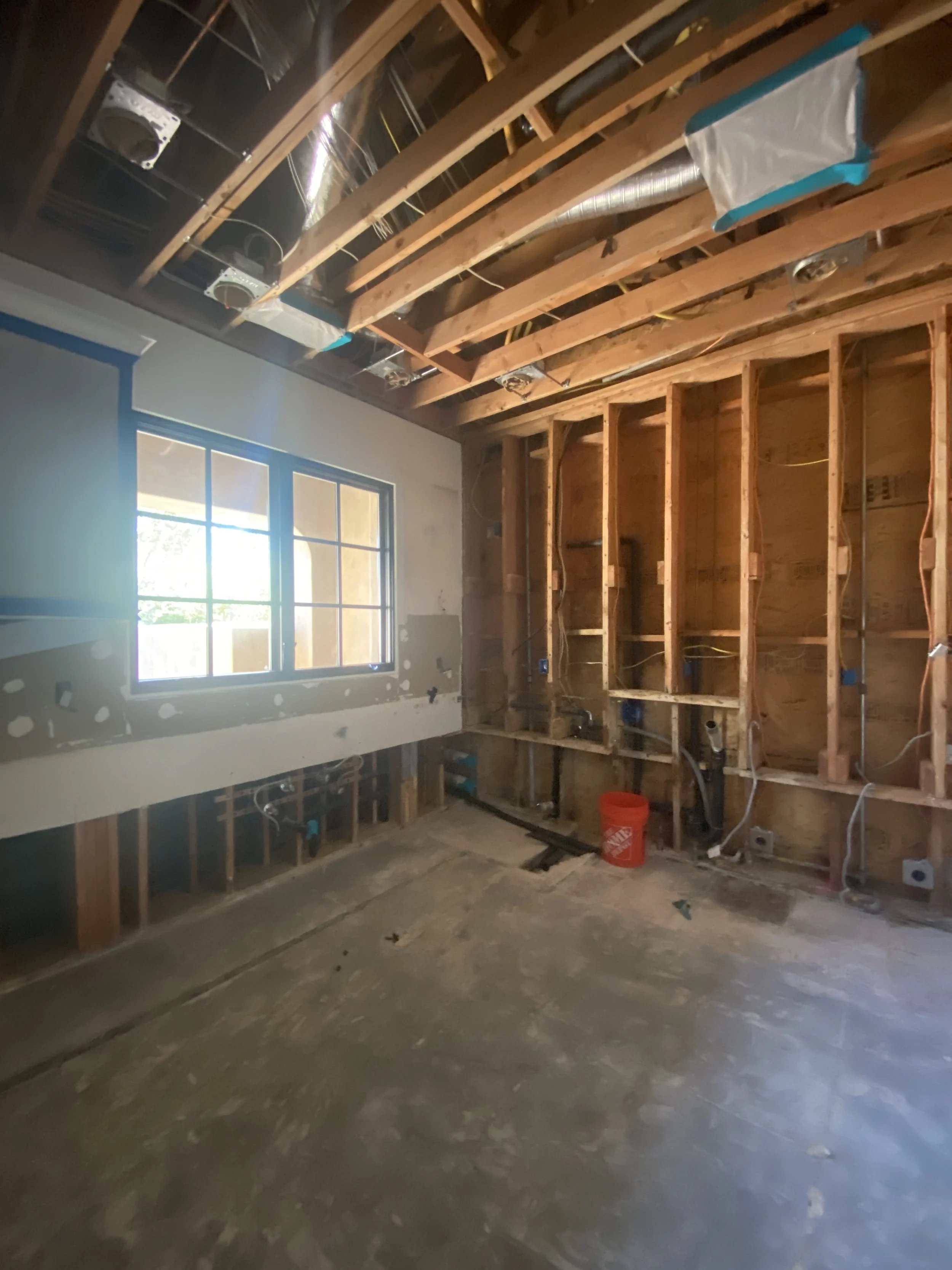
When a water leak caused damage to their San Diego home’s kitchen and laundry room, these homeowners decided to take the opportunity to hire us to help them reimagine & transform their spaces. They wanted a modernized kitchen with a light and airy atmosphere, natural elements, a new layout to accommodate their large family and plenty of room for entertaining.
When it came to selecting materials, we knew that the combination of white oak and marble would make a stunning pairing that embodies the light, airy & organic look they were going for. After finding these gorgeous slabs from Petra Stone, we decided to maximize their visibility in the design by incorporating waterfall island countertops and running the countertops up the backsplash. This also creates a high-end, cohesive feel in the space. We also decided to reconfigure the layout by ditching the original cumbersome island and replacing it with two side-by-side islands which optimize both functionality and space. One serves as a working island with appliances, featuring a built-in Galley sink (which if you haven’t heard of, you’re going to be obsessed!) and the other with added bar seats for entertaining.
Another way we created a visually light space was by using white, modern, upper cabinets that we took to the ceiling and by adding open shelving to flank the hood. If you know us, you know we love a good shelfie moment and these ceramic, wood and organic-inspired accessories add to the overall earthy vibe of the kitchen.
Shop the Look:
fabulous & functional
We often tell clients, “Just because challenges arise, it doesn’t mean your remodel is going wrong, it just means you’re remodeling!” There will inevitably be bumps along the way but knowing the right people makes a world of difference! When we realized that the damaged flooring couldn’t simply be replaced because it was no longer manufactured, we partnered with Akovash Hardwood to create custom hardwood flooring to match the original wood floors throughout the rest of the home. The kitchen already featured gorgeous, exposed beams, so to tie the entire space together we had them faux-painted to match the custom cabinetry & light wood flooring.
While the material finishes are stunning, we have to talk about, dare we say it…these sexy appliances! This kitchen features a state-of-the-art 48-inch Wolf range, microwave drawers, a unique ZIP faucet with sparkling water on tap, two sinks, and two dishwashers, making the kitchen as functional as it is beautiful!
all the important things
Speaking of beautiful & functional, this little moment is the epitome of both. We framed in this niche and added two 30-inch Subzero refrigerator columns, two freezer drawers, and a 24-inch wine fridge, all integrated within built-in cabinetry panels to hide the appliances and create a sleek, modern and seamless finish across the entire kitchen. A Miele espresso machine & steam unit add the finishing touch…as we always make space for the most important things in life…like coffee and wine!
For a seamless look, the adjacent butler’s pantry, incorporated the same custom oak cabinetry and white marble countertops as the kitchen. It also features a third sink with a pristine wine glass display customized for our clients who are avid wine connoisseurs.
a conversation piece
In the dining room, we embraced the original arched architecture of the room but modernized it with new furniture, lighting, cabinetry, and some stunning, custom moments. When we learned of our client's love of wine and saw their impressive collection, we knew that we wanted to create a special place for it to be showcased. These custom glass and iron doors enclose a temperature-controlled wine cooler that features backlit crystal slabs. Talk about a conversation piece! We had to get a little creative when it came to running the electrical for the backlighting, but we love a good design challenge and are SO in love with how this dazzling display turned out.
a splash of glam
The laundry room was already gutted from the leak so it was truly a blank slate. The entire design was built around these bold & unique Cement Tile Shop tile floors that tie together the entire project’s color palette with an added luxe touch. We again carried the custom cabinetry and marble countertops through from the rest of the project. A two-washer, two-dryer set up, plenty of countertop space & functional floating shelves make this space a triple threat, serving as a laundry room, mudroom & storage room!
Shop the Look:
Tying it all together
Last but certainly not least, we updated the adjacent great room with the same, gorgeous white oak cabinetry as the rest of the home to truly tie all the spaces together. The custom media cabinet keeps things sleek by allowing media equipment, toys and the like to be tucked away. The cabinets beautifully compliment the other natural elements in the room make this space feel warm, organic & oh so cozy.
To see all the gorgeous views of this project, head to our Portfolio.
Love how we designed this project?
If you’re looking to kick-start a project, let’s connect! Working with a Designer will not only save you from making costly mistakes but help the overall project go more smoothly.
As an Amazon Associate we earn from qualifying purchases.


